Choosing the right paint colors for your home is both an art and a science. Colors have the power to influence mood, create harmony, and visually expand or contract spaces. When carefully selected, the right hues can elevate your home's design while reflecting your personal style. This guide delves into the science of color and offers practical advice for selecting the perfect tones for every room in your home.
Understanding the Psychology of Color
Color psychology is the study of how different hues affect human emotions and behavior. Each color evokes specific feelings, which can set the tone for a room’s atmosphere. Understanding these associations can help you select colors that align with the purpose of each space.
For example, warm colors like red, orange, and yellow tend to be energizing and stimulating, making them ideal for social spaces like kitchens or living rooms. Cooler colors, such as blue, green, and purple, evoke calmness and relaxation, making them well-suited for bedrooms and bathrooms. Neutral tones like beige, gray, and white provide a versatile backdrop and promote a sense of balance, allowing other design elements to stand out.
When choosing paint colors, consider how you want each room to feel and how that aligns with its function. A harmonious palette creates flow throughout your home, while bold accents can add personality and character.
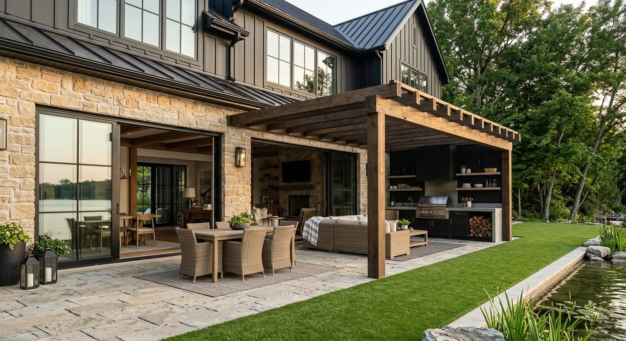
Choosing Colors for the Living Room
The living room is often the heart of the home—a place where family and friends gather. The color scheme you choose should encourage conversation and comfort while reflecting your style.
Neutral tones like soft grays, warm beiges, or crisp whites are popular choices for living rooms because they provide a versatile canvas that complements a wide range of furnishings and decor. Adding accent walls in deeper shades, such as navy blue or forest green, can create depth and visual interest without overwhelming the space.
For homeowners who enjoy vibrant interiors, warm shades like terracotta or muted mustard can add a touch of energy and warmth to the room. The key is to balance bold colors with neutral elements to maintain a cohesive and inviting feel.
Creating a Restful Bedroom Retreat
Bedrooms are sanctuaries where relaxation and rest take priority. Cool, muted tones are the go-to choice for creating a soothing environment that promotes sleep and tranquility.
Soft shades of blue, such as sky blue or pale aqua, are particularly effective at fostering calmness and reducing stress. Lavender and pastel green are other excellent options for creating a restful ambiance. If you prefer neutrals, opt for warm grays, creams, or taupes, which provide a cozy yet sophisticated backdrop.
To add a sense of luxury, consider incorporating darker, moody hues like deep teal or charcoal on an accent wall behind the bed. These rich colors can create a cocoon-like effect that enhances the sense of intimacy and relaxation in the space.
Designing a Productive Home Office
The rise of remote work has made home offices an essential part of modern living. When selecting paint colors for this space, focus on hues that boost focus and creativity while minimizing distractions.
Blue tones are often associated with productivity and concentration, making them a popular choice for workspaces. For a more energetic atmosphere, consider greens, which symbolize growth and balance, or yellows, which stimulate creativity and optimism.
If you want a neutral palette, opt for light grays or off-whites to create a clean and uncluttered environment. Adding pops of color through artwork or decor can provide inspiration without overwhelming the space.
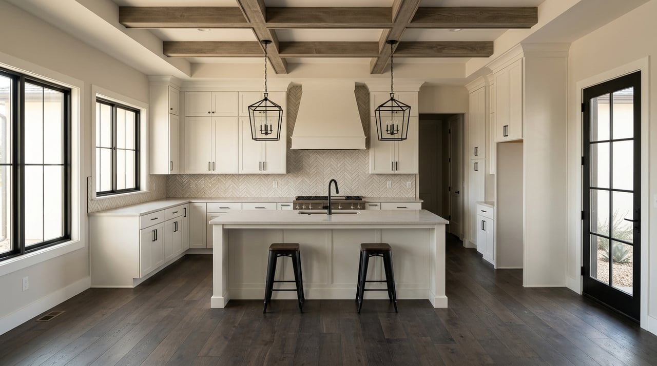
Brightening Up the Kitchen
Kitchens are dynamic spaces where functionality and style come together. The colors you choose should feel lively and inviting, as this is often a hub for social interaction and meal preparation.
Warm colors like yellows, oranges, and reds can create an energetic and appetizing atmosphere. For a more modern look, soft whites and cool grays offer a timeless appeal that pairs beautifully with stainless steel appliances and natural wood accents.
If your kitchen has limited natural light, lighter shades can help brighten the space and make it feel larger. On the other hand, darker hues like navy or charcoal can create a striking, sophisticated look when paired with ample lighting and lighter cabinetry or countertops.
Elevating Bathroom Design with Color
Bathrooms are often viewed as utilitarian spaces, but the right color scheme can elevate them into serene retreats. Cool tones like seafoam green, aqua, or pale gray create a spa-like ambiance that feels refreshing and clean.
For a bolder approach, consider deep jewel tones like emerald green or sapphire blue, which add drama and sophistication. These colors work especially well in powder rooms or smaller bathrooms, where a bit of boldness can create a memorable impression.
Neutral palettes, including whites, beiges, and soft grays, are timeless and versatile, providing a clean and airy feel that suits both modern and traditional designs.
Coordinating Colors Throughout Your Home
While each room in your home can have its own personality, a coordinated color palette helps create a sense of flow and unity. To achieve this, choose a base color that appears in multiple rooms, and use complementary or analogous colors to add variety without clashing.
For example, a neutral gray can serve as the foundation for your color scheme, while pops of blue, green, or warm earth tones create visual interest in different areas of the home. Transitioning between colors that share similar undertones ensures a cohesive look that ties the entire home together.
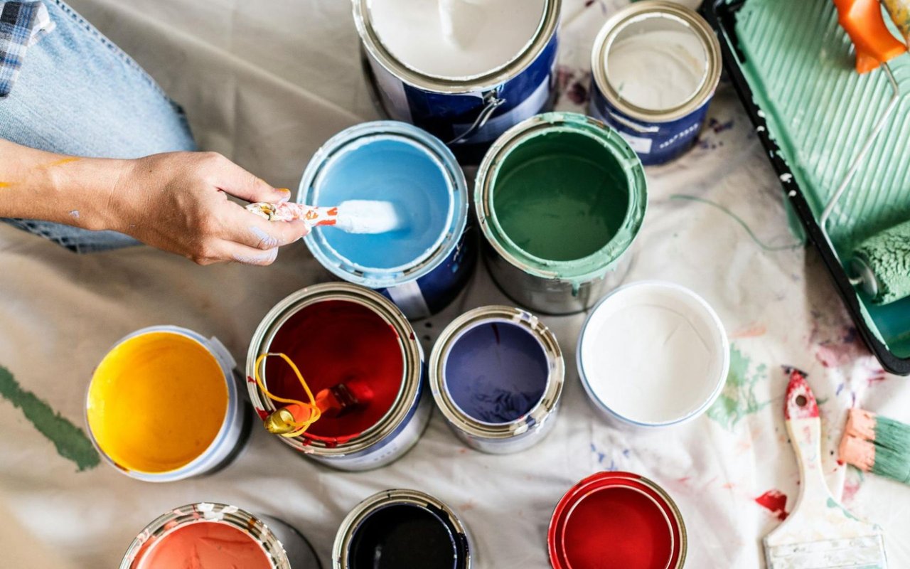
Test Colors Before Committing
Once you’ve selected potential colors, test them in the room before making a final decision. Paint samples on different walls and observe how the colors appear under various lighting conditions throughout the day. Natural light, artificial light, and shadows can significantly impact how a color looks in a space.
Testing colors also gives you the opportunity to see how they interact with your furnishings, flooring, and decor. Taking the time to evaluate samples ensures you’ll be happy with your choice in the long term.
Find the Perfect Home to Bring Your Design Vision to Life
Choosing the right paint colors is a transformative step in making a house feel like home. By understanding the science of color and considering the unique purpose of each room, you can create spaces that are both functional and beautiful.
If you’re ready to find a home that’s perfect for your design vision, Topper Real Estate is here to help. Whether you’re searching for a charming family home or a modern retreat in Blanco County, Texas, their team of experts can guide you every step of the way. Reach out to Topper Real Estate today to learn more about Blanco County homes for sale and start your journey to a beautiful new home.